The goal of the project was to redesign the existing Craigslist App and to create a visually pleasing user interface as well as a better user experience.
Previous
Next
Research
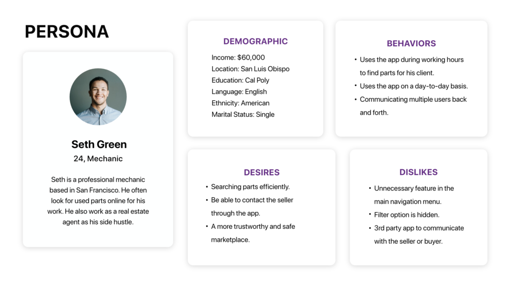
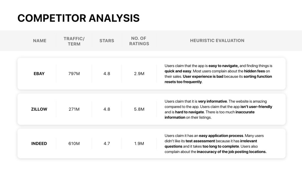
I gathered users data from the App Store and did user interface research on my phone to develop my understanding of overall structure works. With all the information gathered, I came up with Persona, Competitor Analysis and Pain Points for the current Craigslist App.
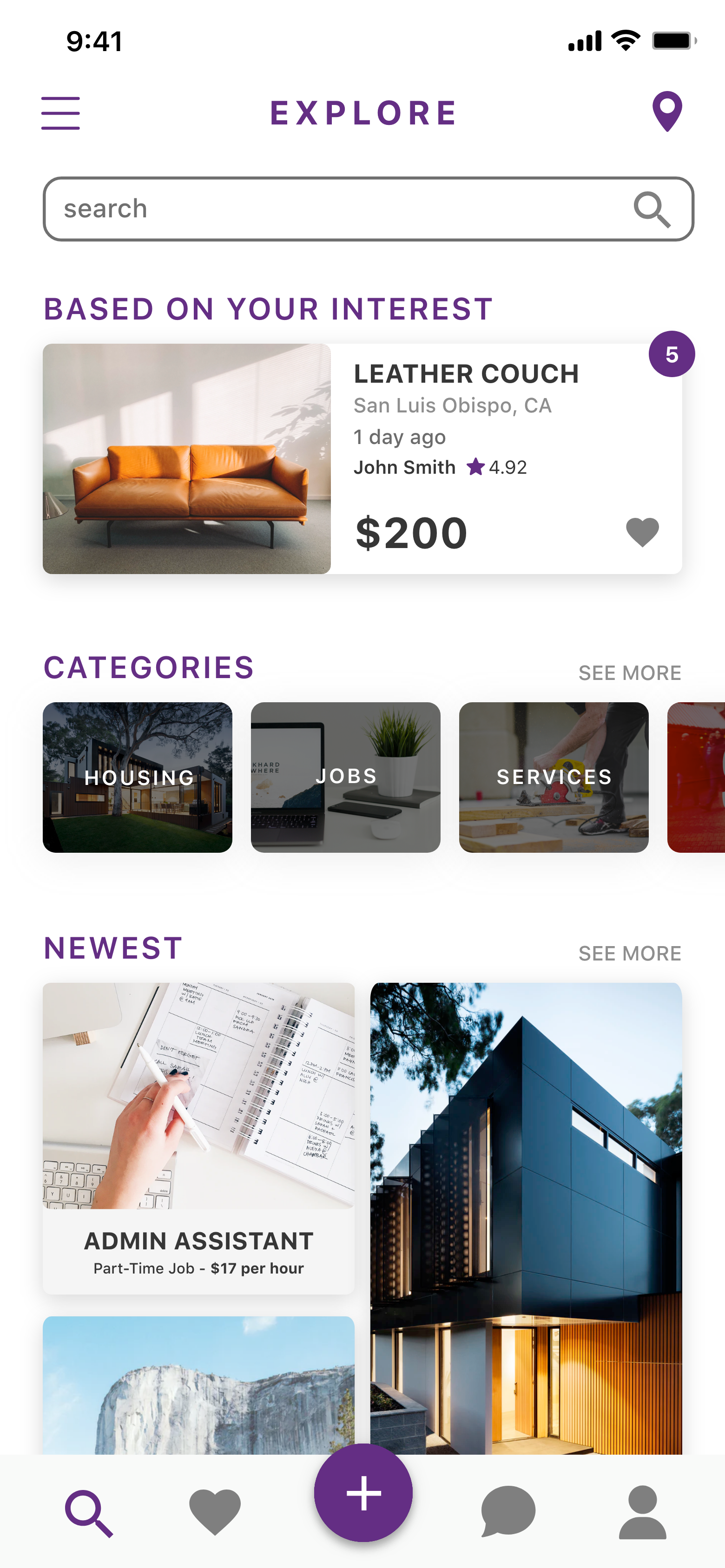
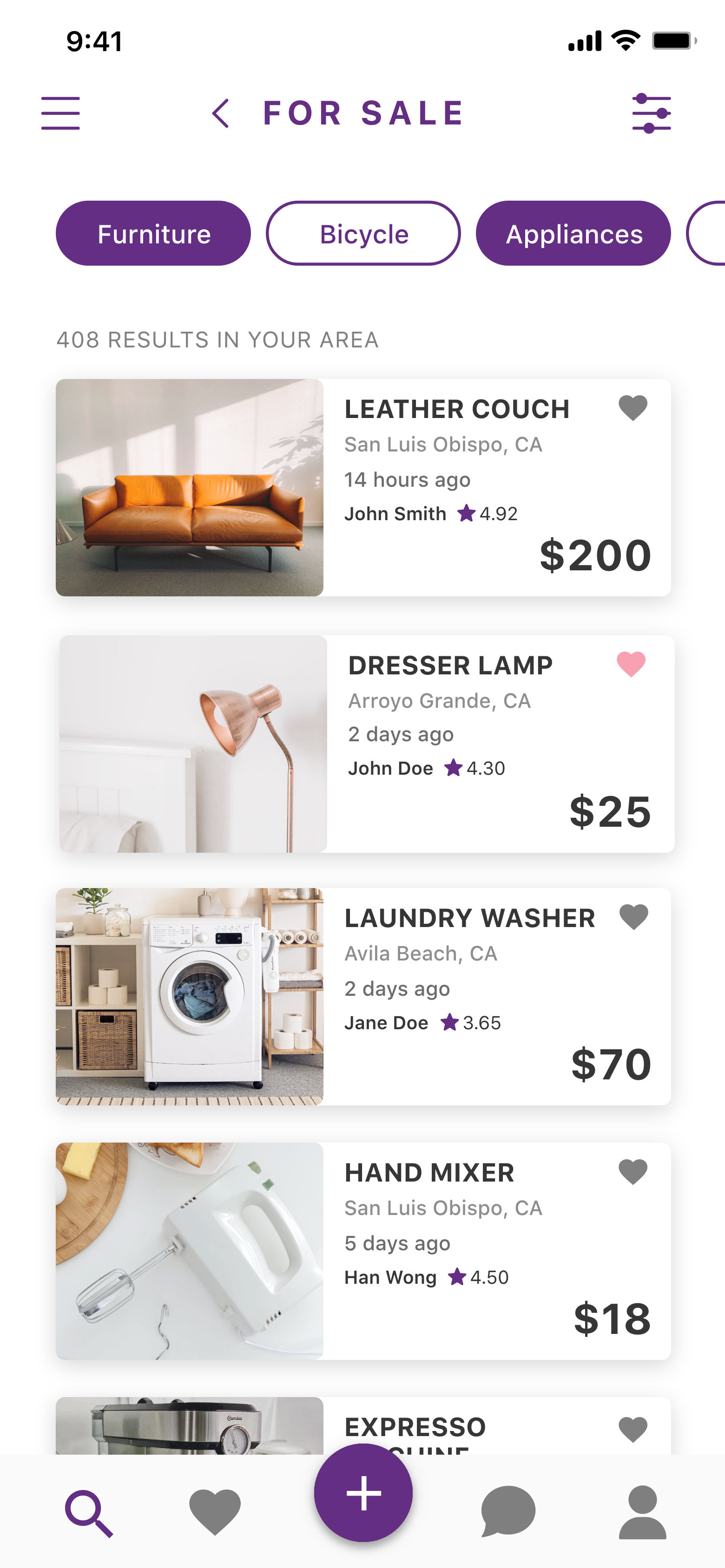
Their product searching structure is inefficient and time-consuming and the categories are arranged poorly. There is a large number of categories on the home page. Some of these categories should be grouped together such as “bicycle” and “bicycle parts”. They should be in a subcategory so when users are looking for something else, these categories will not be in the way. Another content issue is, there are no icons identifying the category quickly. This leads to a lack of visual representation for the categories.
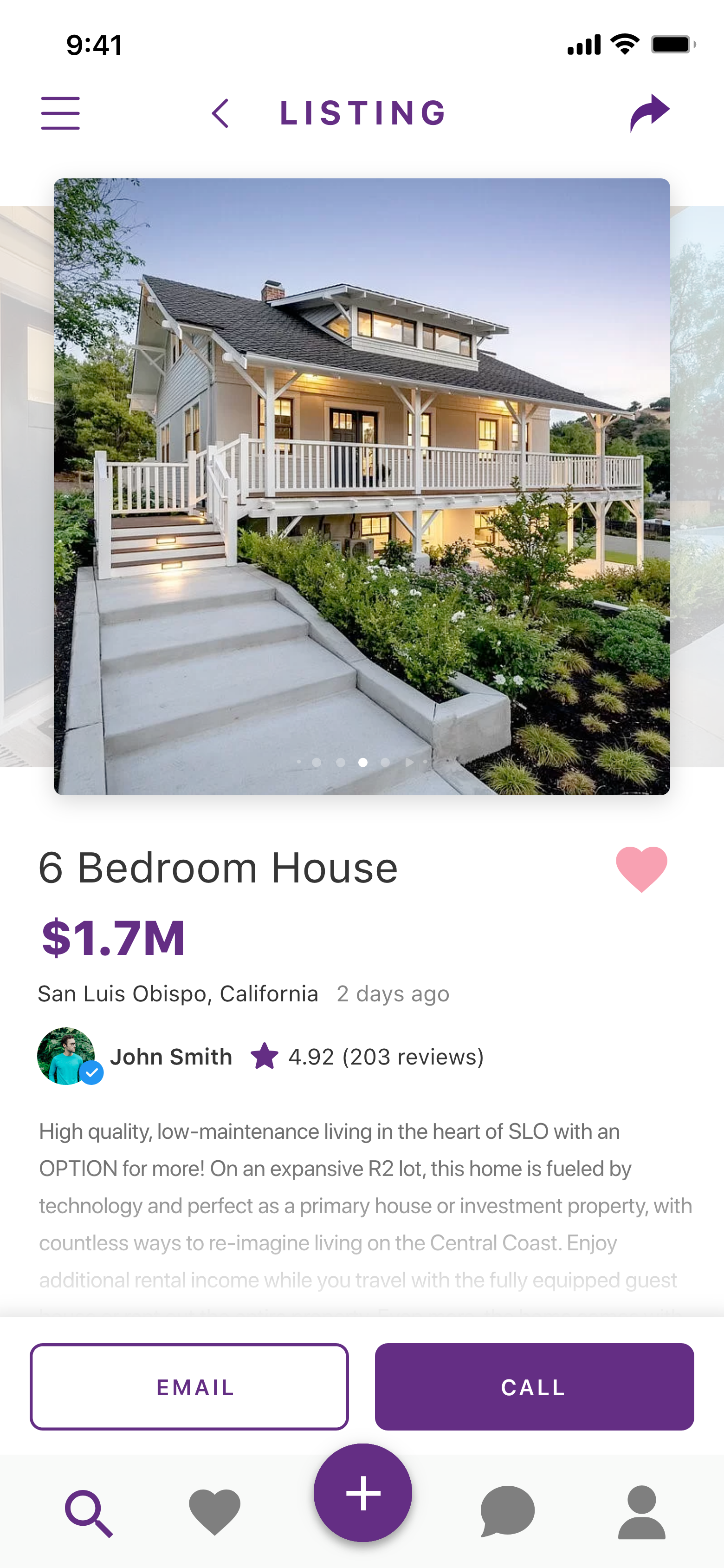
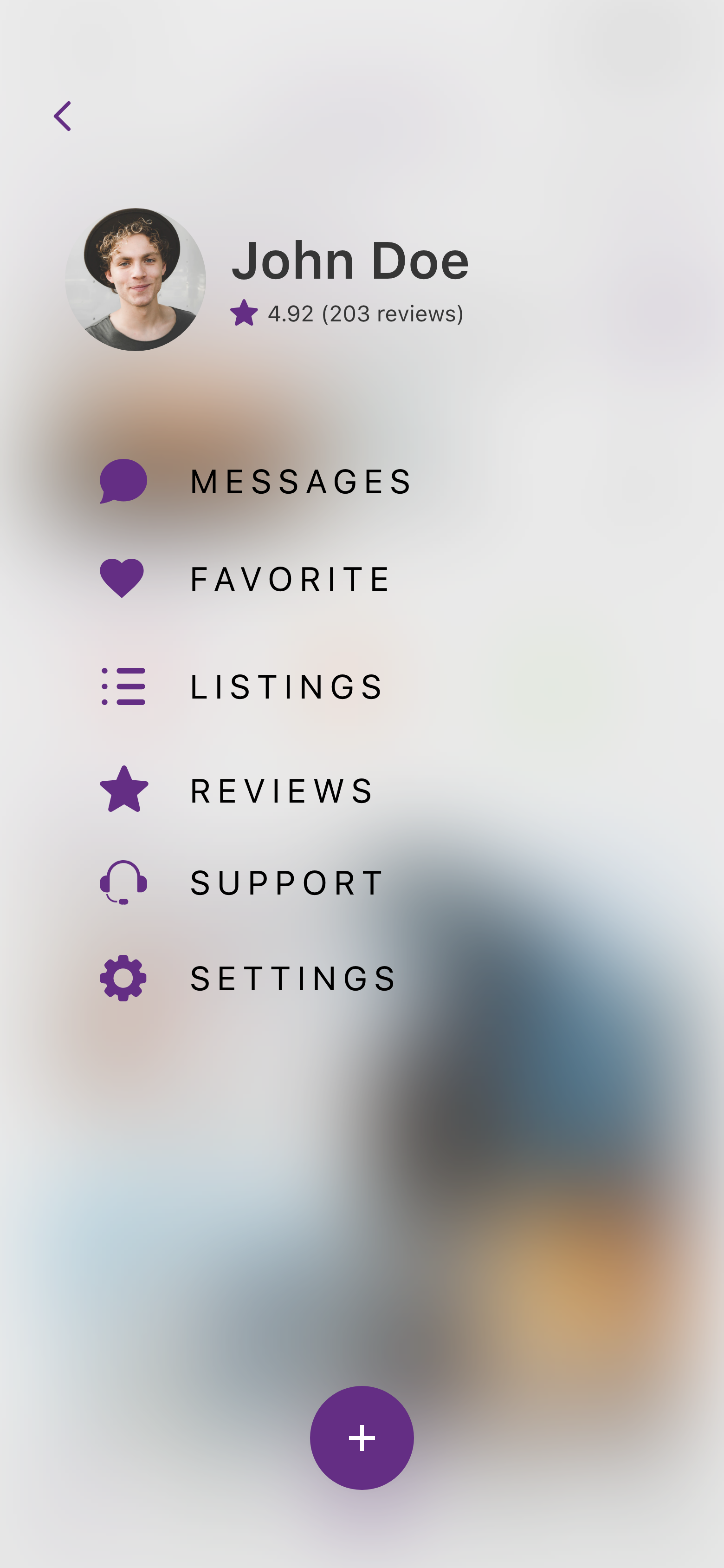
The feedback function is misplaced. Feedback is a useful function, but it is not an important function. This function could be placed somewhere under the account’s tab instead. It is difficult to navigate the current message function easily. They should replace the feedback tab with something more useful such as an improved notifications or messages tab. Categories that are similar are not grouped together. They should consolidate some of the redundant tabs into one larger category in order to create a more streamlined experience.
The app does not have any technical issues, however, there are a lot of duplicate posts in the app. In addition to that, there is a review regarding a user who encountered a racist post where it says “only hiring pale-faced people”. This spreads a feeling of exclusion in the platform. One solution I have would be to have a team that could monitor and filter out duplicate and offensive/exclusive posts.
The app is not user-friendly. Its filter function is hidden therefore it is not as efficient to search for a specific product. The filter function should be visible and easily accessible so users can search for things more quickly. There are a lot of scammers on the platform. A solution would be to provide a verified checkmark on the user profiles. This can help ensure their customers’ trust and build a safe and secure community within the platform.
The design of the app under appreciates its function. The layout looks bland because there is no color coding, no icons to identify a product quickly. In addition to that, there are typography issues because its leading and tracking are not well adjusted therefore its information looks chaotic. Overall, It is less interesting and efficient than other shopping apps like eBay. This is important because it creates a high bounce rate for the app.
Process
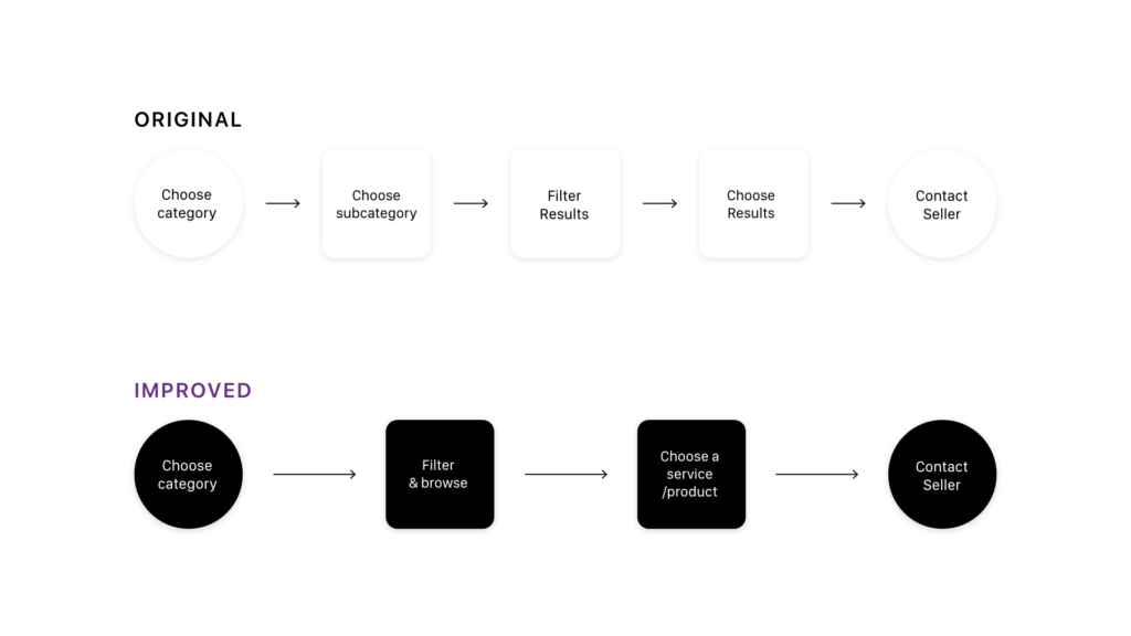
I start developing my design by creating Wireframes and Task Flow to get a sense of the app flow. Then I create a Design System to keep the app consistent throughout the experience.
