Swoop
Community Rideshare App
Project Overview
Swoop is a rideshare platform specifically cater for college communities, which allows students to post and request rides safely. In Cal Poly, students rely on a Facebook rideshare group to commute to a long distance destination. However, the current solution to search and request for rides — Cal Poly Ride Share Facebook Group — is unguided, unclear, unsafe, and difficult to browse which can discourage people to share rides with other students.
In iter8, my team and I designed a rideshare platform allowing students to seek or create rideshare groups safely.
Problem Statement
Members in the Cal Poly Ride Share group have voiced many concerns with the safeness of the group. Riders often question if the person they are riding with is credible and if there are still seats available. Since many people rely on this
group to commute to long distance destination, it is crucial that seats information is clear and accurate and it is safe to ride with.
How might we develop a better, more safety solution that help riders browsing experience and increases ridership?

Research
To empathize with our target audience and those who use the rideshare group, we created two user journey map, starting from user login all the way to payment interaction. This helps us understand the process and actions riders and drivers take to reach their destination.
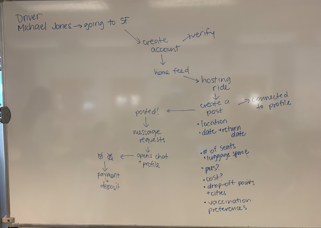
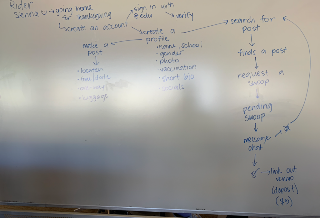
To gain more in-depth insight on our users, we interviewed several students that uses the ride share group. From our interviews, we repeatedly encountered a few pain points users encountered when using the rideshare group. For example, users commonly had trouble to look for a rides that cater to their specific preference. Freshmen also voiced concerns about the credibility of the group. Those insights led us to decide to focus our ideation efforts on the earlier steps on the journey map: planning and deciding on the features to put in the app.
Ideation
After sharing our findings as a group, each team member drew from the must-have features and design elements from our How Might We statements to sketch ideas. We brainstormed in words, then drew sketches, then iterated on each other’s sketches. With all of the ideas dumped, each of us then created wireframes to showcase our solutions.
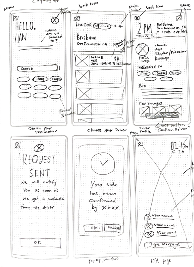
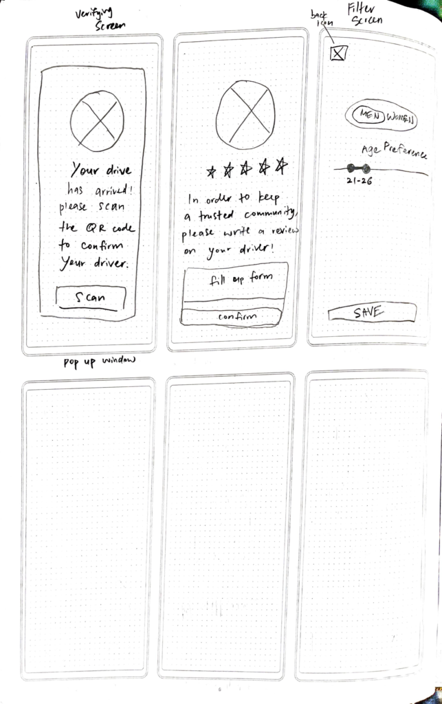
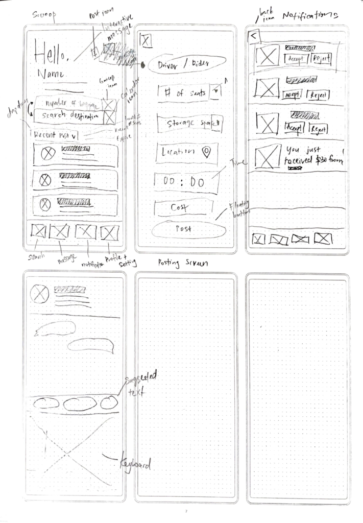
To finalize on the information architecture of app, we discussed each group member’s solution sketches, critiqued each
solution, and voted on our favorite ideas to determine our key features. A few solutions stood out:
- A filter function that featured on the browsing screen to help users to look for rides in their preference
- An SSO login page to help create a secure community in the platform
- Including bookmark function when viewing a post
Before we start prototyping, we created a user flow to connect all the solution sketches in the order in which a user would engage with our application.
Design
System
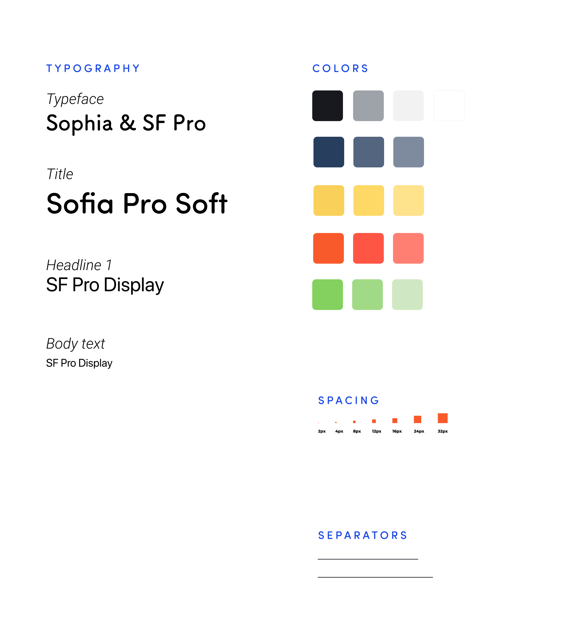
For our high-fidelity screens, we worked on developing our interface
design system based on our research insights. We wanted the app to look professional but also fun and friendly so we chose to use dark blue as our primary color and work with a rounded sans serif typeface.
SOLUTION
A rideshare platform specifically cater for college communities, which allows students to post and request rides safely.